RISE Commercial District
The challenge
An inflexible site slowed marketing efforts and couldn’t scale with growth.
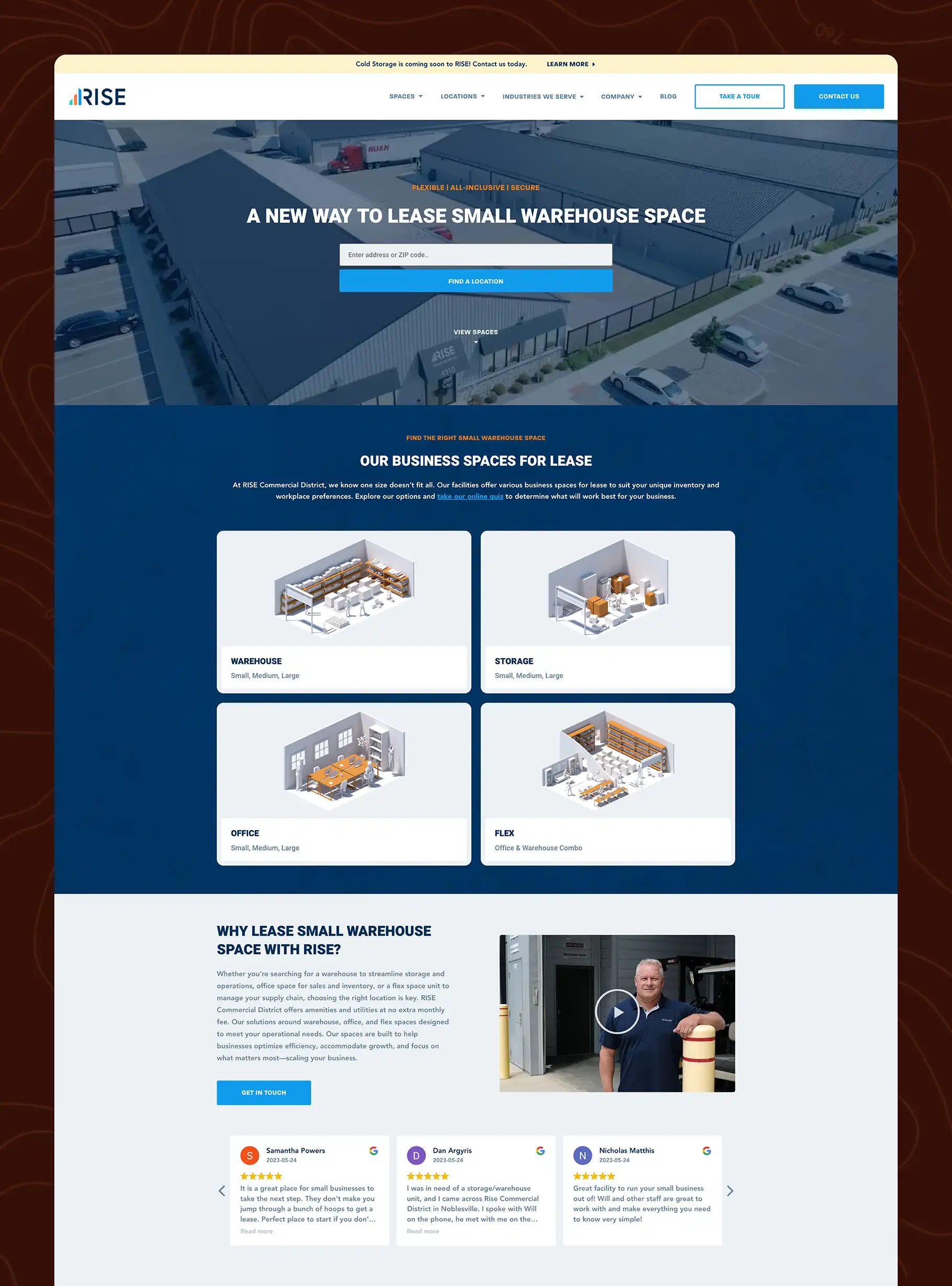
RISE Commercial District initially partnered with Expedition to design a new website, but due to a preexisting agreement and an effort to reduce development costs, the build was handed off to another vendor. Unfortunately, the resulting site lacked the functionality and flexibility the RISE team needed. Basic updates became frustratingly difficult, support was limited, and performance issues began to negatively impact the user experience.
Ultimately, the decision was made to not just maintain the provided website or fix what was built, but to take a fresh approach to developing a site that could better support their goals. The timing was important as well since they were expanding their offering and adding locations so they wanted a site that could grow with them. The previous website, along with the version that briefly replaced it, didn’t reflect the scale or professionalism of their evolving brand. It was time to get it right.
The Solution
A scalable website designed and developed for performance and flexibility.
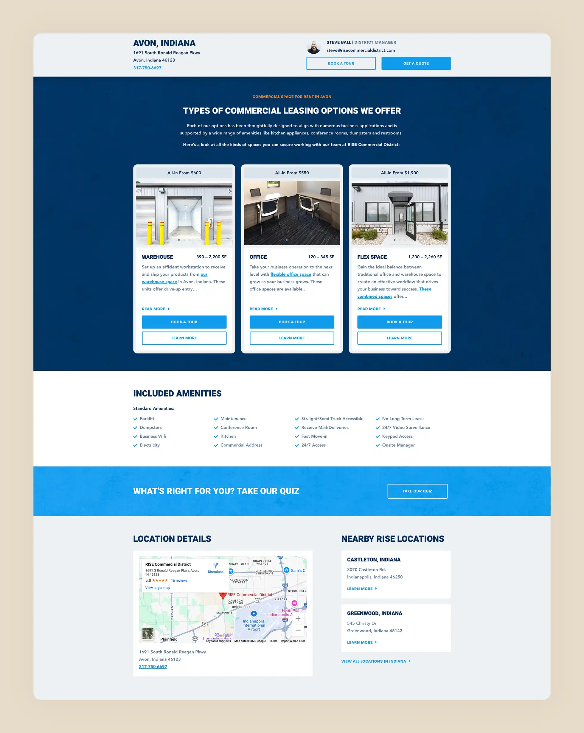
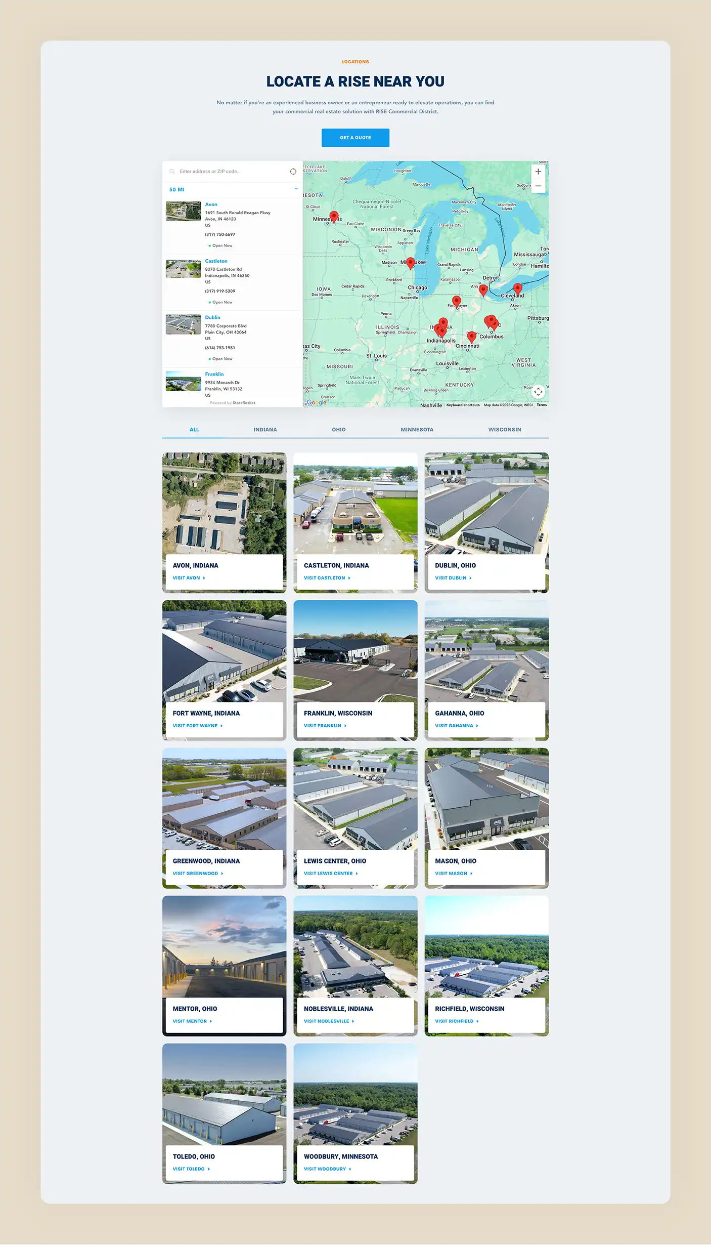
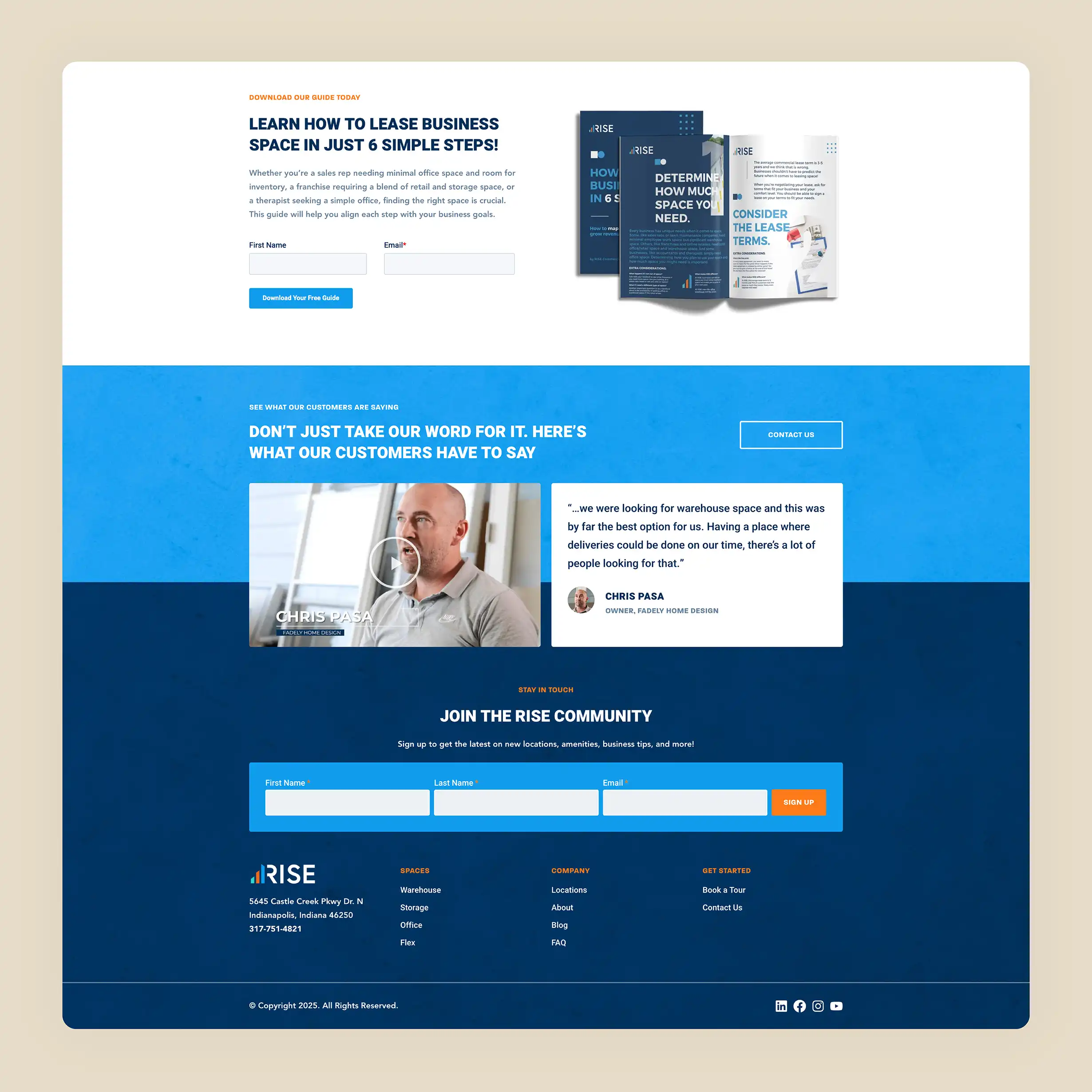
We approached the project by reevaluating the site structure and focusing on clarity, conversions, and scalability. A streamlined sitemap and a strategy for future content made it possible to plan for visitors navigating the site, while better organization of existing content allowed for better communication of their offerings from launch. We also introduced dynamic location mapping, allowing users to explore available properties in a more intuitive way.
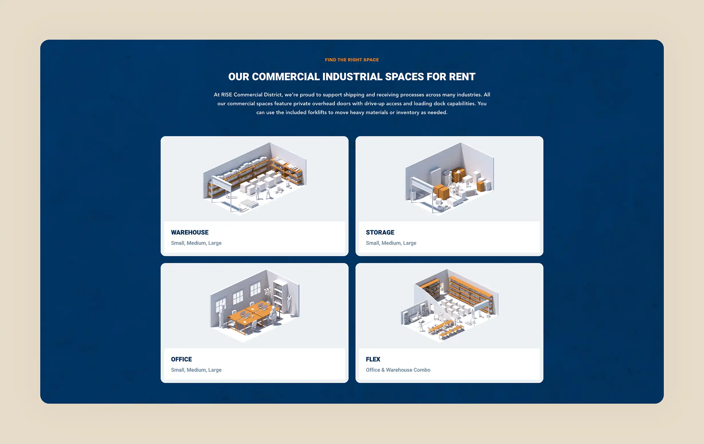
As part of the design process, we created 3D rendered models of RISE’s different space types to visually represent what tenants could expect and add clarity and polish to the user experience. We also expanded on RISE’s branding with updated colors, new imagery, textures, and icons. Behind the scenes, the site was rebuilt using a flexible content editing system, empowering the internal team to create and manage pages with ease. The result is a high-performing, modern website that’s both visually striking and built for long-term growth.
The Results
A reliable partner and a website that supports future marketing efforts.
Since launch, the new RISE Commercial District website has become a key driver of visibility, credibility, and conversions. With improved page speed (67% faster), a scalable structure, and intuitive editing capabilities, the marketing team now has the tools they need to keep the site evolving alongside the business. The new structure has also helped RISE rank for more targeted keywords, contributing to greater reach and improved SEO performance.
As we’ve seen the website perform post launch, the RISE team shared that they credit the new website as a factor in their company’s recent momentum: “We get lots of compliments on our website—both from outsiders and I also hear from the CEO on a regular basis that he gets compliments. He has also shared that he believes a lot of our recent growth has been due to the new website.” As our partnership continues through ongoing support, the site remains an active part of RISE’s marketing engine.
67% faster load time
A performance-focused rebuild means the site loads quicker and works harder for users.
Flexible page builder
3D space visualizations
Custom-rendered models help visitors get a clear, engaging view of each space type.
Refined visual branding
Updated colors, textures, and imagery give the site a polished, cohesive look.

Embark on your Expedition
Ready to explore the possibilities? Let's talk.
Every great idea starts with a conversation — and we want to have it. Whether you’re looking to build a brand, design a website, or craft a new digital experience, tell us a little more about your project and we’d be happy to see if our team is the right fit.
